Salmonella - Host Interaction Network - A Detailed, Better Visualization
By Güngör Budak
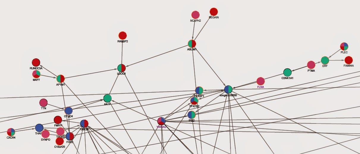
- 2 minutes read - 239 wordsWe’re almost done with the analyses and we’re making the final visualization of the network. As I previously posted, the network was clustered and visualized by time points. After that, we have done several more analyses and here I report how we visualized them. I’m going to post more about how we did the analyses separately.
First, the nodes are grouped into experimental and not experimental (PCSF nodes). This can easily be done by parsing experimental network output and network outputs of PCSF. Second, using Salmonella human host interactome is used to find out proteins that are host proteins in Salmonella infection. These are imported as network tables into Cytoscape and visualized as shown below.
Next, another set of analyses (not visualized yet) has been done to find out “the most important” proteins in the network. Four features are used: path damaging percentages, in degree centralities, out degree centralities and betweenness centralities. I used Python package NetworkX again for computing these features. After I obtained a value for each feature for each protein, I also imported them as a network table into Cytoscape.
Here is how I visualized each feature:
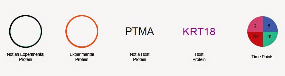
For time points, a protein has all four colors when it’s seen at all time points. Colors change according to time point(s) proteins are seen at.
Below, there is a subgraph of newly visualized network:
The features that are not visualized yet will also be done and reported soon.